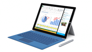
It took a while to pry the Surface Pro 3 away from Joanna long enough to give it a proper hands on test but, now that I’ve done so, I thought I’d share my thoughts on the newest tablet from Microsoft.
I’m looking at this Surface Pro 3 (SP3) hands on review from the perspective of a Surface Pro 2 (SP2) user considering an upgrade to a SP3 and eager to see what Microsoft is offering with their newest powerhouse tablet product.
I’ll tell you up front that I don’t plan on upgrading my SP2 for an SP3. Not because I don’t think it’s an awesome tablet (because it is) but, because I don’t think it’s any better than my SP2 considering my needs.
Surface Pro 3 Hands On: Form Factor & Weight
It’s no secret that the SP3 is bigger yet lighter than the SP2. In our comparison post between the SP2 and SP3 we had a section talking about the size and weight differences.
However, you can’t really appreciate those numbers until you hold a SP2 up next to a SP3. The difference is simply striking. I have found that the SP3 feels more comfortable to hold due to it’s weight than my SP2. It’s quite amazing to think that Microsoft got such a powerful computer into such a small package, along with that much battery life.However, due to it’s size and thinness, I feel that I have to really hang onto it, i.e. grip tight, because it’s a bit awkward to hold. This is especially true when I’m holding it in one hand. It also brings to light an issue that I’ll cover in the Screen section below.
Surface Pro 3 Hands On: Power Button
The new power button placement is taking a while to get used to. In fact, after a couple of weeks, I still have to do the “tap, crap, slide, tap” maneuver. That’s what I call it when I tap the location where the Surface Pro 2 button is located, say “crap” to myself, slide my finder down to the new location, and tap the button.
I understand Microsoft moved the power button location to make it easier to use in portrait orientation for note taking but, I find it awkward, especially when I’m holding it in landscape mode which is about 95% of the time. I imagine that most people are using it in landscape mode a majority of the time, especially if they have a Type Cover keyboard attached.
So, I think Microsoft should have left the button where it was on the SP2 but it’s my personal preference and only a minor annoyance.
Surface Pro 3 Hands On: Screen
One complaint I hear a lot from folks when using their SP2 in tablet mode is that the on-screen keyboard covers too much of their screen and makes it difficult to see what they’re typing in some applications. Below, I did a comparison using Google Chrome in desktop mode as an example.
As you can see, on the SP2 screen, the search field is obscured by the on-board keyboard but not so on the SP3. I know you can mitigate this a bit on the SP2 by holding the screen in portrait mode but that can be a pain.
In addition, the SP3 screen feels so much better for things like taking notes and displaying web pages because it’s more of a “traditional” monitor shape.
However, not everything is awesome with the SP3 screen. In fact, I have a major concern with the thinness of the glass. During my testing, I noticed that it flexes when I press on it near the speaker holes.
Unfortunately, I discovered that if I picked up the SP3 with one hand along the edge of the screen my thumb happens to land right in that weak area. When that happens, the glass sometimes deflects enough to distort the edge of the screen and it looks much like when you press on a non-touch LCD screen.
This is a bit disconcerting coming from the SP2 which feels as solid as a steel plate. Frankly, the flex makes it feel flimsy.
I know the thinner display stack is designed to reduce the parallax when you use the pen (and that works very well) but, I have concerns that this could result in damage to the display.
Surface Pro 3 Hands On: Kickstand
I really like the new kickstand. The ability to set it to practically any angle is very useful, especially when I’m using it on my lap. I don’t know how well the mechanism will hold up over time but Microsoft said they did lots of testing to ensure wear wouldn’t be a problem.
For the moment, I’m choosing to trust Microsoft on this.
Surface Pro 3 Hands On: Pen
I really like the SP3 pen over the SP2 version. It just feels more like a real pen when you use it. The SP2 version always just felt a bit cheap, in my opinion, whereas the SP3 version feels solid and has some heft to it.
The button arrangement has taken some getting used to, though, and I don’t like the loss of the “eraser” function for the…. well…. eraser button at the end of the pen. The click to bring up OneNote is really cool, however, and is probably worth the trade.
Overall, I really like the SP3 pen. See the differences between Surface Pro 2 pen and Surface Pro 3 pen.
Surface Pro 3 Hands On: New Type Cover
The new Type Cover is essentially the same as the old Type Cover just with a thicker border around the keyboard, an improved track pad, and an extra set of connection magnets.
For some reason, though, it feels like a larger keyboard even though the keys are the same size as before.
The improved track pad is really nice. On the SP2 version, I always had some issues where it wouldn’t track smoothly and the buttons were hard to click but the SP3 touch cover’s track pad feels like glass and the buttons are a bit easier to click. It’s probably because the track-pad is 66% larger than before.
Something else Microsoft did with the new Type Cover is the addition of a pen loop. It’s a decidedly low-tech solution to the ever present pen attachment issues with the Surface but it does work.
Also, with the second set of connection magnets, I really can use it on my lap. I find it to be stable and comfortable.
Even when using it on a table top, I like to connect the second set of magnets because it tilts the screen up into a more ergonomic position for typing.
The only (minor) criticism I have for the SP3 Type Cover is that they should have used an elastic loop as opposed to a cloth loop for the pen, because it would better secure the pen and make it easier to get in and out of the loop.
But, all-in-all, the new keyboard is a winner.
Surface Pro 3 Hands On: Using my SP2 Accessories
This is where I really had a problem with the SP3 design choices. It’s almost like Microsoft consulted Apple on the best way to rake in some extra cash from their user base. So, be warned, I don’t really have any good things to say in this section. On the plus side, I only really have a couple of complaints so it’s not too bad.
New power connector: I find the power plug change annoying and unnecessary. While the new connector does work well, it’s not really an improvement over the old version.
In addition, it definitely means that any extra SP2 chargers I have are now useless on my SP3.
Power Cover: While the Power Cover connects to the SP3 and works as a keyboard, the SP3 will not recognize it as a secondary battery!
Really, Microsoft? I spent $200.00 USD on this Power Cover and I can’t use it to extend the battery life of my Surface Pro 3?
I can even see the contacts for the power connection on my SP3 when I look at the connector on the SP3. It has the hardware to make it work!
My hope is that Microsoft will rev some firmware to allow it to work at some point in the future and that they don’t lock it down to a new Power Cover model.
Surface Pro 3 Hands On: My Conclusions
Despite some criticisms, I think the Surface Pro 3 is an awesome machine. It’s light, powerful, and feature packed. I just don’t think I need to upgrade to it from my Surface Pro 2 which is also an awesome little machine.
Funny enough, the post I did on whether or not you should upgrade your Surface pro 2 to a Surface Pro 3 turned out to be right on the money after my Surface Pro 3 hands on testing.
I hope you found my perspectives on the SP3 helpful. Please feel free to drop a comment and let me know what you think.
Tim


